Tuesday, July 29, 2008

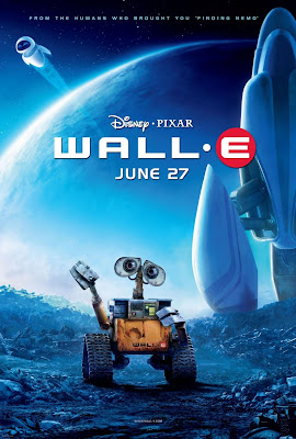
Wall-e


I had no intention of actually seeing this film until I was dragged along to it because there was nothing else on at the Cinema. However I was pleasantly surprised. It was a slow start to what I couldn't quite believe was a disney production. No need to say the Pixar graphics were faultless but the story line was one beyond what Disney normally throws out. It saw humans abandon the earth which they had turned into a giant dumping ground, leaving robots to clean up the mess (ie Wall-e) while they to circle in space a ship on a giant vacation. The cruise space ship offers all the humans needs taken care of by robots and it seem that in the production of hover chairs nobody walks any more and everyone is fat. Every one is also too lazy to eat food and consequently takes their food as a drink they can sip through a straw. People communicate only electronically on a screen and are completely oblivious to the what goes on around them. UNTIL life on earth is detected and its time to finally go home!!!

I'm surprised at how relevant this story is to how our planet is heading now! And apparently it no coincidence! A friend informed me that On the Toy Story box set DVD extras They talk about their idea for Wall-e but decided it would have more impact to hold production until the right time, when people realised just how relevant it is.

Friday, July 11, 2008

Type in the Sky


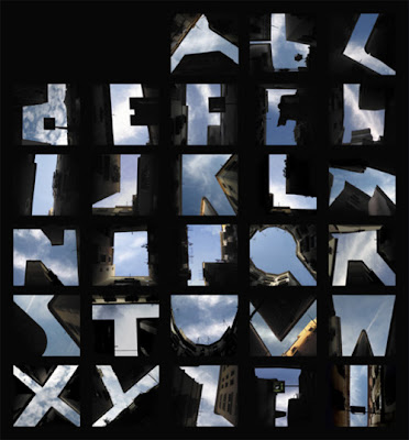
Wow...I remember when I went to New York, all I could do was look up at the skyscrapers which created amazing shapes and reflections in one another! How ever I never saw anything like this. I love that somebody has taken the time to find these letters in the sky and I wonder how many pictures they had to take before they got the right formations. It's also a reminder to look up every once an a while!

Italic Poster


I came across this rather literal poster and although I really liked it due to its quirky and obvious pun, I couldn't decide if it annoyed me that it didn't have a purpose. It was a poster telling me it was a poster, there is no other purpose for it other than its visual pun.....however it made me laugh which has to give it some sort of validation.

Thursday, July 10, 2008

Art Deco Architecture


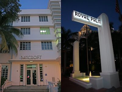
Most people think that America lacks character because its so new and all the buildings are made out of concrete and look the same. After spending nearly a year there I can vouch that for the most part this is true, in Florida anyway. However on a trip to Miami's, South Beach I was struck by the amazing Art Deco style architecture. The majority of these buildings function as hotels that have been restored and modernised, some act as restaurants or bars but for about 15 blocks thats all you can see! Sleek smooth lines running up and down the buildings giving the area so much character, class and style! It was one of the most beautiful cities I have ever been in not just because of the style of the buildings, but also because of the uniqueness of the place its self! I've really never seen anything like it!

Tuesday, July 8, 2008

Fat Pig


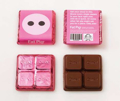
Fat Pig Chocolate really stood out as a simple sleek fun packaging design for the chocolate! So often small packaging looks cluttered and disorganized due to the amount of legally required information they have to put on etc. It is also nice to see something a little more modern as the brand leaders such as cadburys and galaxy and nestle have a much more tradtional approach on packaging!

Monday, July 7, 2008

Growing Creatives


I have no idea if this was a TV advert, a personal project or made for some other reason, but...I love it! If only it was that easy to get the creative juices flowing!

Sunday, July 6, 2008

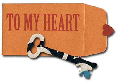
This is a cute little gift I found while searching for an anniversary present! Although it has absolutely no use and is probably over priced I thought it was simple and sentimental gesture made through design. 

Controversial Copy Writing

This is an advert for an american teen drama Gossip Girl. It uses an adaption of the popular abbreviation OMG (Oh My God) to portray the steamy shocking story line of the show. It caused an uproar among many, as people were shocked of the insinuation of the word 'Fucking'! Although the words its self was never said it is amazing how much controversy it caused. Whilst in America I saw a news interview with the head of marketing for the channel it is shown on who said It could mean a number of things. This got me thinking if people are angered or upset by this shouldn't they be blaming themselves for assuming that 'Fucking' is what the F stands for, or at least just accept that today swearing is common language and although adverts like these are designed on a level for the younger generation, this age group swears more than any other!

Personally I think its a really clever idea which related to the target audience and got the exposure the show wanted! I'm sure they were aware when they came up with the idea that it would raise some eyebrows, but saw it as an opportunity to gain publicity.

Saturday, July 5, 2008

Feltron Annual Report


This is the Annual report for Nicholas Feltron....This is not a big company but a person! It is the documentation of Feltron's Life in 2007.


Feltron is a Graphic Designer who has collected data from the last year and condensed it into an annual Report. It contains things like how many miles he travelled in the year, the percentage of actives making up an average day and many more unusual statistics!

This is a great and unusual concept which as a personal project has grown to a commercial success for Feltron as designers like myself can appreciate the graphical layout and transformation of brining the data to life. It is definitely worth checking out in print as the images on the web don't really do the whole thing justice!

Friday, July 4, 2008

Misprinted Type


www.misprintedtype.com

I stumbled across this website the other day and wanted to share it with everyone! I think this is a really nice example of mixed media. This guys uses retro images with hand rendered type and drawings. Some of his pieces have strong concepts behind them, others are more for fun. However the main reason for pointing this website out was how refreshing it was to see some graphic design that hasn't been churned out solely on a computer!

Wednesday, July 2, 2008

Jean Kilbourne

I saw this woman speak at UF and she touched on some really interesting stuff. She basically talks about women in the media and how they are objectified and the results this has on women in the real world. I'm really into this subject and looking into it for a potential dissertation topic. Sometime she comes across as a feminist and exaggerates her point a little but over all it worth taking notice.

Starbucks Logo


On my visit to a Starbucks in Orlando Florida this summer, I was surprised to see a new logo for the company. On inspection of this much more traditional take on the double tailed mermaid I could not understand how I had not heard about a possible rebrand for the Company. As it turns out there is no rebrand! Merely an attempt for Starbucks to get back to its roots and show it as a established Coffee brewer! This logo is an adaption of Starbucks first ever logo (not wanting to cause a commotion with the original logo as the mermaid bared her breasts) used to convey Starbucks as a more well rounded traditional company after over 35 years of success.

The logo is being placed on cups and cup holders for a limited period of time. I can only think that Starbucks is trying to shed its Image as the Big Greedy Corporate Coffee Making Machine that puts smaller privately owned Coffee shops out of business by opening a brach up on every corner! Whether or not it will convince the people who don't like to fund the big corporations is doubtful, it may however please its existing customers to think they aren't buying into the brand but in fact a 'Classic Coffee Maker'.